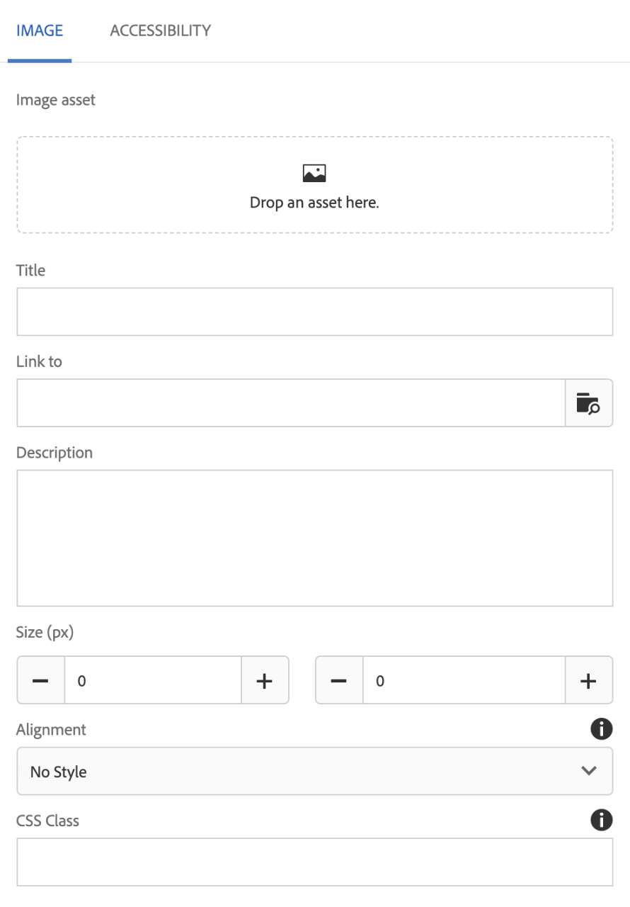
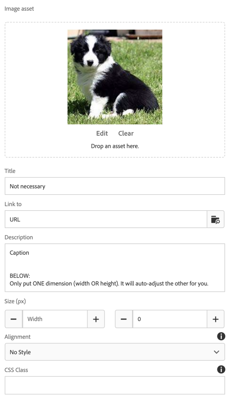
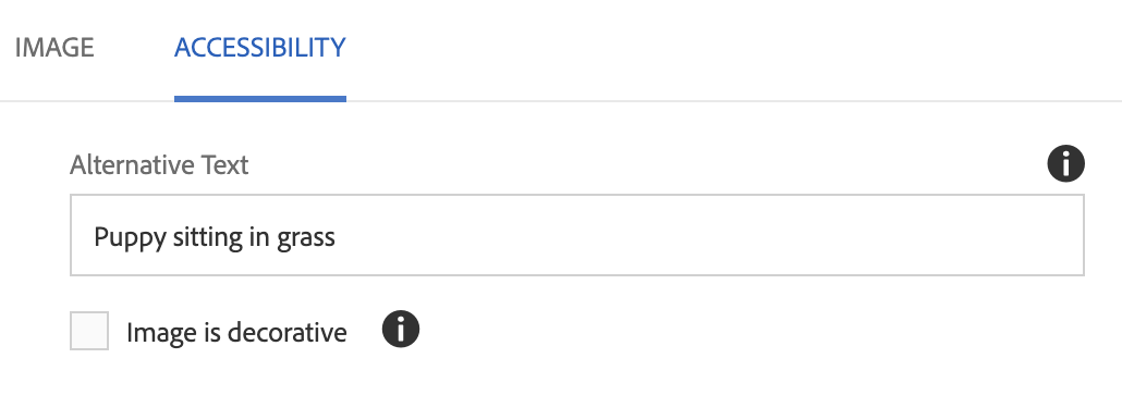
You can find the OU Image component in your trusty side panel.
OU Image – OU General
To add an image to your page, you must first upload the image in the DAM (see Digital Assets Manager). Then you may access the image from the Images tab in the Content Finder on the left.
Recommended Sizes
| Type of Image | Size (in pixels) | Usage |
|---|---|---|
| Feature | 2000 x 750 | Large rectangular image across top of page |
| Card | 900 x 600 | Horizontal rectangular image used in card |
| Accent | 600 x 800 | Vertical rectangular image sometime used for headshots |
| Square | 600 x 600 | Profile cards |
Usage
- Place a single image on your page
- Place an image with a caption (Description) with it
- Place an image that serves as a clickable link
Where to Find It

What It Looks Like – Tab One: Image


In the Image tab of the OU Image component, you will see some fields you can fill out:
- Title: This is not necessary, as we would recommend you set alternative text in the Accessibility tab of the component.
- Link to: You may make your image a clickable link by adding a URL (more info here).
- Description: Serves as a caption.
- Size (px): You may adjust the size of your image – however, we would recommend loading the image in the size you need it – this is useful if you are using an image from another department
NOTE: You only need to adjust one dimension and the other will adjust accordingly. If you put dimensions in both height and width, the image will be forced into those dimensions and the result will be distortion. - Alignment: Alignment of image.
- CSS Class: The only CSS Class you may want to use with an OU Image is break-before or break-after to add spacing between components.
- Edit: This will open the image in the DAM. NOTE: This is editing the image file, not just the rendition showing on your page.
- Map: This will allow you to link a portion of the image (like the puppy's nose). It is not very accessible or user friendly, so we recommend NOT using this function.
- Crop: This will allow you to crop the image – however, we recommend loading this image in the size that you need it, but you may crop if necessary.
- Rotate: If you some reason your image is sideways, you may rotate it so it appears correctly – please do not turn to puppy on his side or upside down, it's not nice.
- Clear: If you are ever REPLACING an image with a new image, use the Clear function – no one would see your old image, but your page could try to load both, so it would slow down your page load time for users.
What It Looks Like – Tab Two: Advanced

In the Advanced tab of the OU Image component, you will see one (THE MOST IMPORTANT FIELD!!) field:
- Alternative Text: This is for accessibility purposes and will appear empty even if you set them from the DAM (see Digital Assets Manager). This is empty to give you the opportunity to override the text set for the image (useful if you are using an image from another department).
This is the MOST IMPORTANT thing to set on your images, as without it, a screenreader will know there is an image, but they won't know what they are missing. It leads to a bad experience for our users.
ALSO, no alternative text means that the University can be sued for not being compliant with ADA accessibility.
To Edit, Etc.

When you select the component, you can:
- Edit: Edit component
- Copy: Copy the component to place elsewhere (you can only cut/copy and paste within the same browser tab)
- Cut: Cut the component to place elsewhere (you can only cut/copy and paste within the same browser tab)
- Delete: Delete a component
- New...: An alternate way to add a new component
- Paste: Paste a component you have cut/copied (you can only cut/copy and paste within the same browser tab)
- Group: To select multiple components at once (to move, cut, copy)


