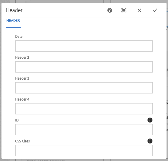
You can find the Header component in your trusty side panel.
Header – OU General
Usage
- Break up text into sections/categories within a page
Header Styles
These will vary by template/design. Example below is for Dept C template.
Header 2
Header 3
Header 4
Where to Find It

In the Header component, you will see a series of fields to fill out:
- Date: Any format you would like, but not necessary always. Remember that each page is date in the footer dynamically when that page was last updated. Use date to date stamp an article/announcement.
- Header 2 (info below)
- Header 3 (info below)
- Header 4 (info below)
- CSS ID: You will only use this for anchoring purposes
- CSS Class: This is where you will place the available CSS Classes (available CSS Classes here). Multiple may be used in a component, separated by a space.
Example: emphasis well
Think of your headers like you would a meeting agenda or a paper you are writing. Your Header 2 is the overall topic(s) of your page, Header 3 is a subject within the Header 2 before it, and Header 4 is for subjects within your Header 3 section.
Example:
Header 2: Marketing and Communications
Header 3: Web Team
Header 4: Sally Staff-Member
You do not have to use all header levels on each page, but use them to break up content and subjects. Do NOT skip a heading level (having a Header 2, then a Header 4), and do NOT use a header for text that is not a true header (just because it's bigger or you like the font).
What It Looks Like

To Edit, Etc.

When you select the component, you can:
- Edit: Edit component
- Copy: Copy the component to place elsewhere (you can only cut/copy and paste within the same browser tab)
- Cut: Cut the component to place elsewhere (you can only cut/copy and paste within the same browser tab)
- Delete: Delete a component
- New...: An alternate way to add a new component
- Paste: Paste a component you have cut/copied (you can only cut/copy and paste within the same browser tab)
- Group: To select multiple components at once (to move, cut, copy)

