You can find the Bootstrap Column Control in your trusty side panel.
Bootstrap Column Control – Bootstrap
Columns can be used to organize your information on a page – whether it be to organize faculty/staff profiles, buttons for your users, or to hold a video that is optimized for mobile viewing. Learn how Bootstrap Column Control works below.
NOTE: Columns stack in mobile, left column and then right column. It is very important to note this for columns with faculty/staff profiles that you wish to appear in alphabetical order, both on desktop AND in mobile. For this reason, we recommend a NEW set of column for EACH ROW (see axamples below).
Usage
- Literally to house ANY component you want, just have it appear in a column instead of full-width.
Where to Find It

What It Looks Like – Placed on Page
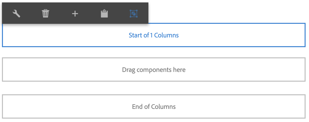
When you place the Bootstrap Column Control on your page, you will notice a new, empty 'Drag components here' placeholder for content to be placed INSIDE of the columns. It will say 'Start of 1 Columns' which obviously, the whole point of columns is to have more than one, so let's proceed to step two.

What It Looks Like – Selecting Columns
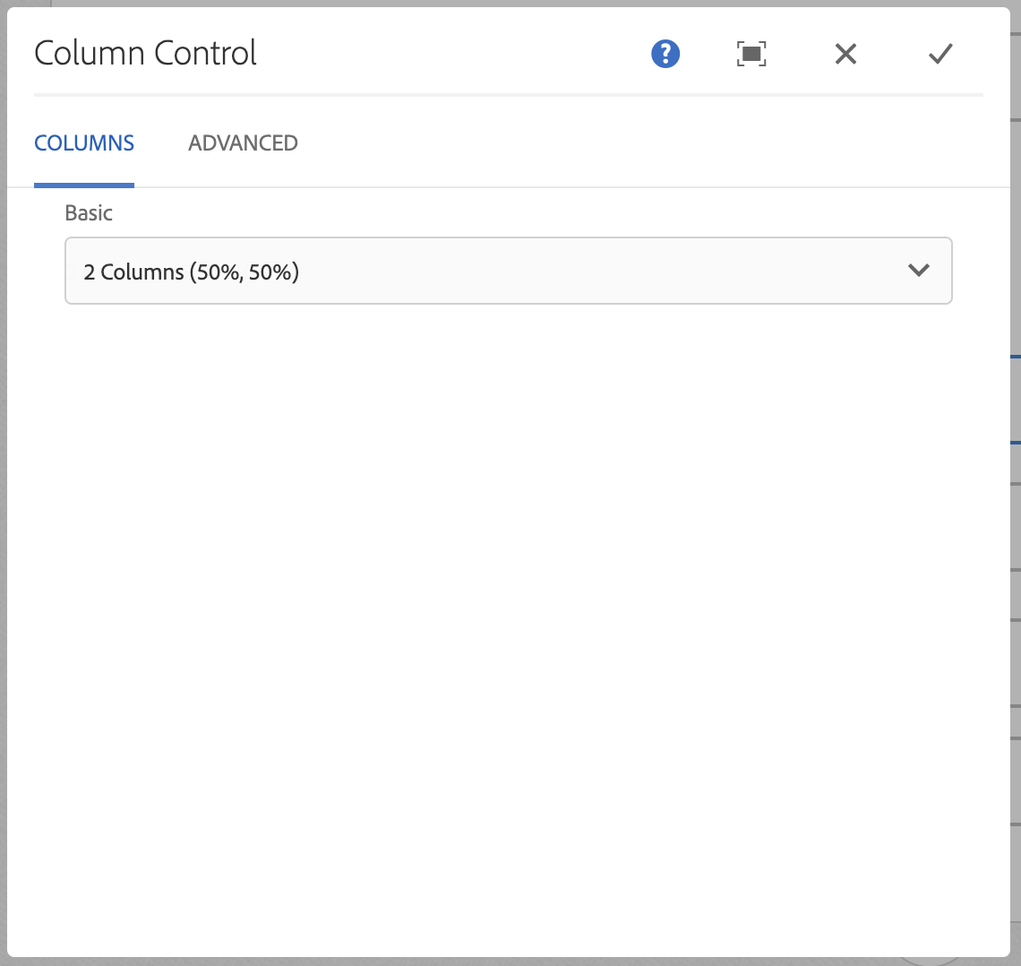
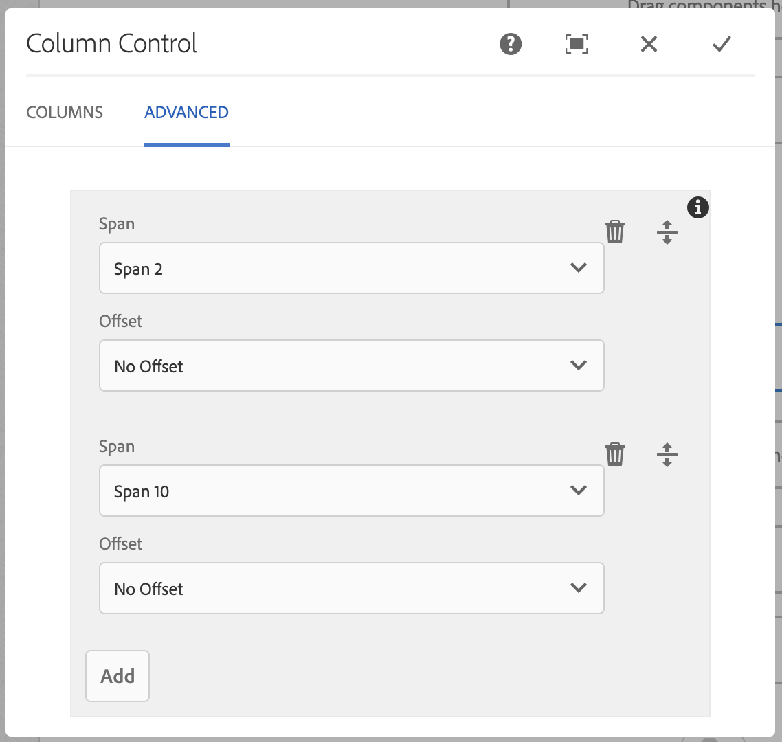
To change the number of columns that you will use, click the Edit tool. You will see some preset options – we recommend using these via the dropdown selection, however, you may used the Advanced Settings if you would like (the columns must add up to 12 total units).
Choose your column layout, and proceed to step three.
NOTE: The component defaults to 2 Columns (50%, 50%). You MUST select that option if that is what you intend to use – the component does not want to decide for you.

Select Use Advanced Settings, then proceed to the Advanced tab, add as many columns as you'd like. Make sure the units span to equal 12. We recommend not using the Offeset – it will push your content into other columns.

What It Looks Like – Column Number Selected
Once you select your columns (2 Columns (50%, 50%) for this example), you may place ANYTHING inside of the columns that you would like.

To Edit, Etc.

When you select the component, you can:
- Edit: Edit component
- Delete: Delete a component
- New...: An alternate way to add a new component
- Paste: Paste a component you have cut/copied (you can only cut/copy and paste within the same browser tab)
- Group: To select multiple components at once (to move, cut, copy)
Columns Example – ONE Set of Columns
To see desktop/mobile formatting, drag browser in from the right, or view page on mobile.
NOTE: In desktop, you will see Puppy A and Puppy B next to eachother on the top row, then Puppy C and Puppy D next to eachother on the second row. In mobile (or with the browser pulled in), you will see Puppy A, Puppy C, Puppy B, and then Puppy D.
If these were faculty/staff members set up in alphabetical order, this would NOT be the way you want them set up.


Columns Example – NEW Set of Columns for EACH ROW
To see desktop/mobile formatting, drag browser in from the right, or view page on mobile.
NOTE: In desktop, you will see Puppy A and Puppy B next to eachother on the top row, then Puppy C and Puppy D next to eachother on the second row. In mobile (or with the browser pulled in), you will see Puppy A, Puppy B, Puppy C, and then Puppy D. (HOORAY!!)


