Skip Navigation

Homepage Feature: Carousel, Tabs, Hero Image

Skip Side Navigation

Homepage Feature

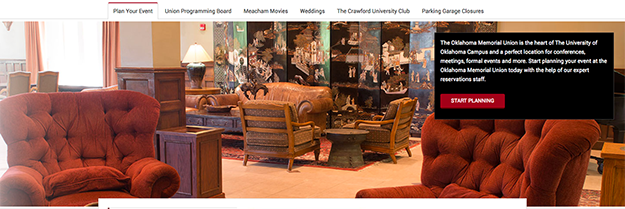
Your homepage is equipped with a feature item: Carousel, Tabs, or a static Image.

Learn below how to edit the feature item.


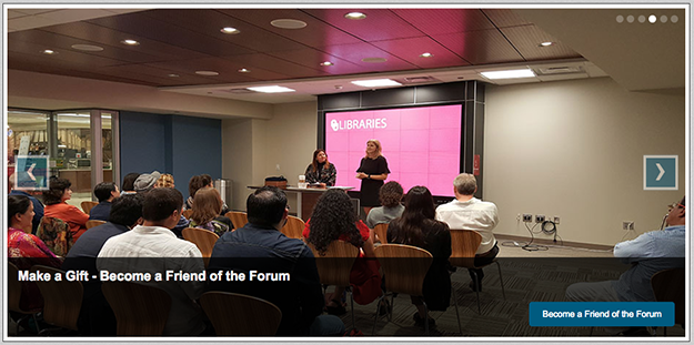
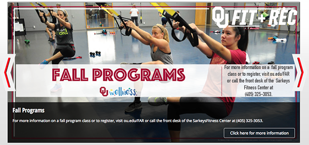
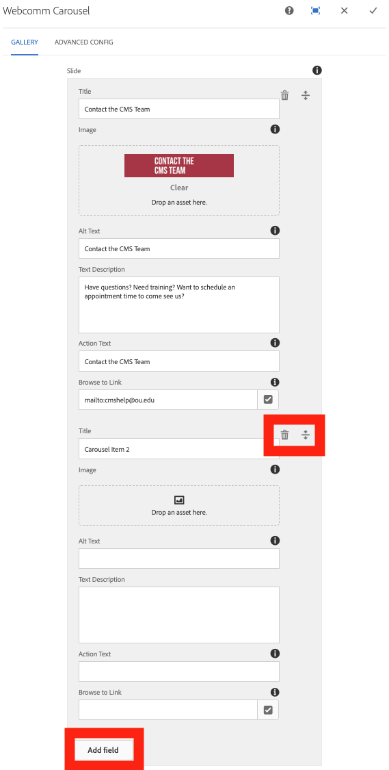
To edit the Carousel, double-click or right-click to edit.

  • Title: Big/bold header for each carousel item
  • Image: Drag and drop image from Content Finder on the left pane of your page
  • Alt Text: ALWAYS add alt text – ESPECIALLY if there is text in your image, EVERY word
  • Text Description: Smaller text for your carousel item
  • Action Text: Button text
  • Browse to Link: Link your button goes to

NOTE: You can add just images, no title, description, action text/browse to link. If you add only images and alt text, your carousel will just cycle through images – no caption box.

In between each carousel item:

  • Up and Down Arrows: Move the carousel item up or down in your carousel order
  • Trashcan: Delete carousel item

At the bottom:

  • Add Item: Add an item to the bottom of your existing carousel items (remember, no more than six allowed – 3-4 items recommended)

NOTE: You can add just images, no title, description, action text/browse to link. If you add only images and alt text, your carousel will just cycle through images – no caption box.


Tabs – Up to 6 Items

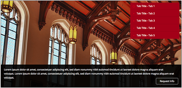
With tabs, you may feature UP TO six items.


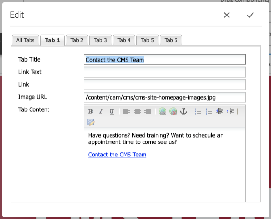
To edit the Tabs, click Configure tool on the component.

  • Tab Title: Title that appears on tab (keep it short!)
  • Link Text: Does not appear on tab – do not use
  • Link: Does not appear on tab – do not use
  • Image URL: MUST copy the path from the DAM
  • Tab Content: Text to appear on that tab item
  • Button: If you want a button, you will have to link and create the button like you would normally (button info here)

Across the top:

  • All Tabs: This content would appear on EVERY tab (not necessary)
  • Tab 1-6: Each tab item has it’s own tab to organize your content

NOTE: Caption box with text is NOT removable. You do NOT have to have a title/text/button, but the area the caption bar/box takes up will increase/decrease based on the content you place in the component – but it WILL NOT GO AWAY if you do not put text with the image.


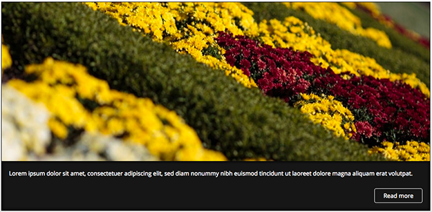
Hero Image – WITH Caption

With image, you may use a static image with OR without a caption box. This is how you have an image WITH a caption.

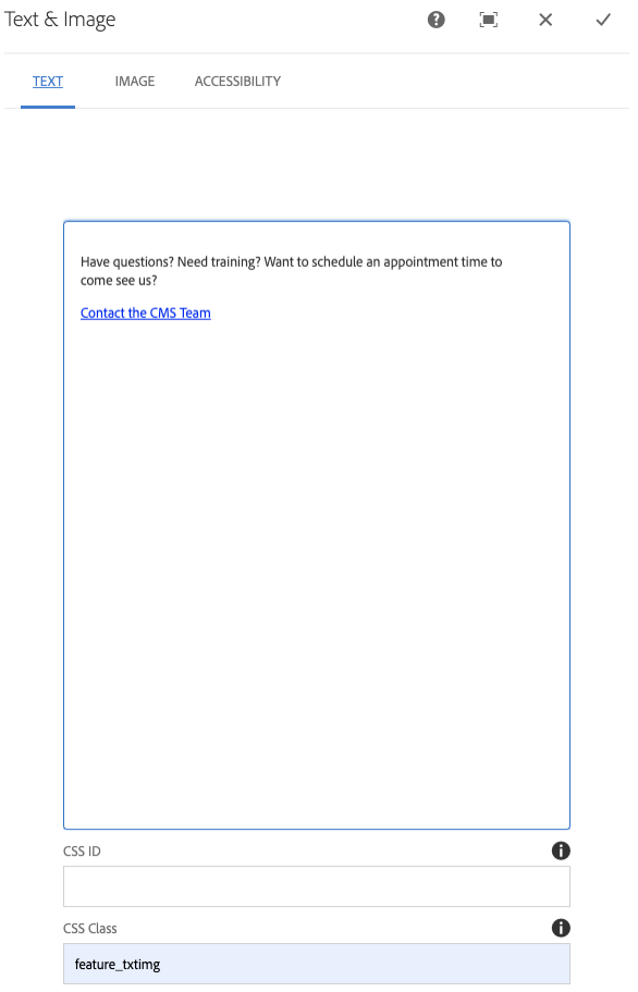
To edit the Text Image, click the Configure tool to edit.

  • Text – Including Headers (via paragraph dropdown): This works like normal, so put whatever text you want, create a link, style it to be a button, whatever you want
  • CSS ID: Do NOT use
  • CSS Class: To get the outline around your image, use CSS Class: feature_txtimg
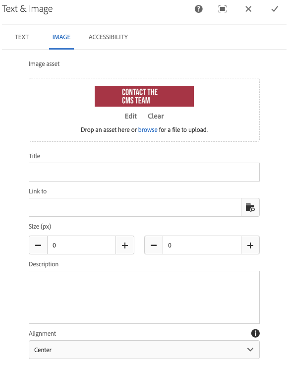
  • Image Tab: Drag and drop image from the side panel on the left pane of your page (and center image)
  • Accessibility: ALWAYS add alt text – ESPECIALLY if there is text in your image, EVERY word

NOTE: Caption box with text is NOT removable. You do NOT have to have text/button, but the area the caption bar/box takes up will increase/decrease based on the content you place in the component – but it WILL NOT GO AWAY if you do not put text with the image.


Hero Image – WITHOUT Caption

With image, you may use a static image with OR without a caption box. This is how you have an image WITHOUT a caption.


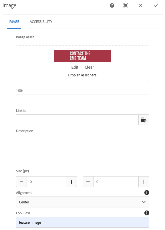
To edit the OU Image, click the Configure tool to edit.

  • Image Tab: Drag and drop image from side panel on the left pane of your page
    • Center the image
    • Image Outline: If you want the outline the images have in the OU Text Image WITH a caption, then use CSS Class feature_image
  • Accessibility Tab: ALWAYS add alt text – ESPECIALLY if there is text in your image, EVERY word.