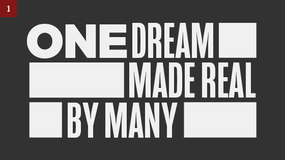
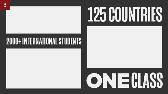
Our compositions use rectangular forms and flexible grids which enable us to create a variety of layouts with the same sense of organization.
All-caps headlines give lines of text a rectangular form that can fit within the gridded system, allowing type and images to interact in an interesting way. Use consistent padding around the type and images to make them feel integrated.
Here are a few examples of how to build a composition:

1. Use blocked out negative space between type for images.

2. Use blocked out negative space between images for type.

3. Create a margin and align type and images.

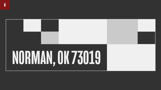
4. Use rules to create grids overtop of images. Incorporate architectural line work into the compositions.

5. Use rules as containers for image blocks.

6. Use a flexible rectangular grid to arrange photos, creating interesting negative space, nooks and crannies for type to sit.