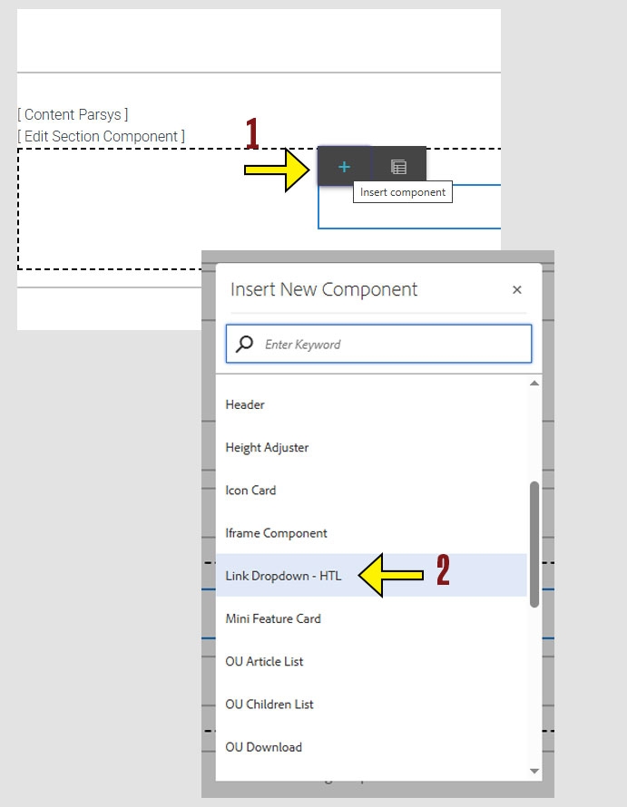
When working within the Content Parsys all web components must first be placed inside of a Section Component
The Link Dropdown component lets you create a menu of related links that users can choose from. This is useful when you want to group multiple links under a single heading to save space and organize navigation.
Click within a section component to insert new components.
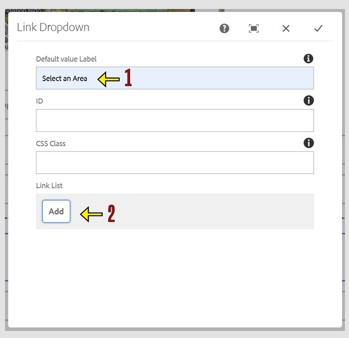
Default Value Label
This is the text that appears in the dropdown before a user makes a selection.
Example: “Select a resource” or “Choose a department”
ID
An optional field used to assign a unique identifier to the dropdown. This is helpful for advanced features like anchor links.
CSS Class
Allows you to apply a custom style to the dropdown using a predefined CSS class.
Link List
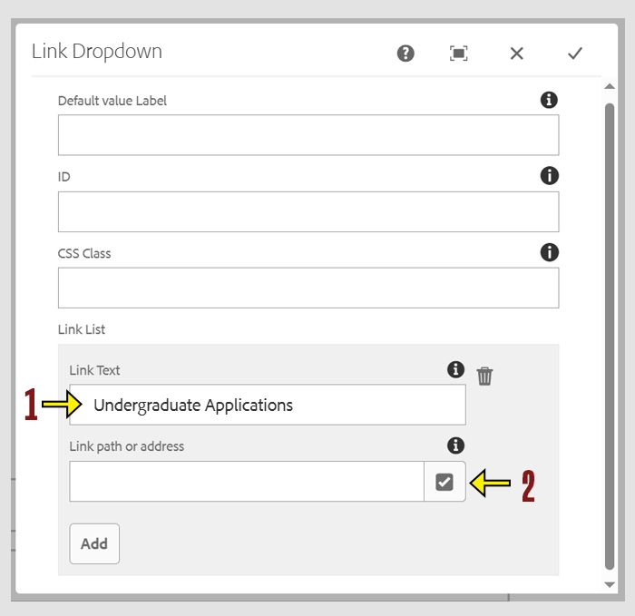
This is where you build the list of links that appear in the dropdown. Each entry includes the Link Text and a Link Path . Users can select one of these options to navigate to the associated page or content.
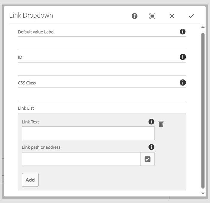
Tip: You can add multiple links by clicking the Add button as many times as needed. Each click creates a new link entry in the dropdown list.
Enter the Link Text you want to display in the dropdown list.
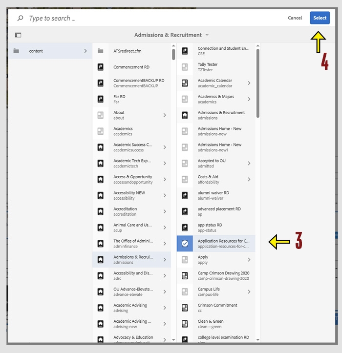
Click the checkbox icon to open the file navigation menu.
Navigate to the page within the CMS that you want to link to.
Click the blue Select button to confirm your choice.
Tip: If you’re linking to a page outside the CMS, type the full URL directly into the Link Path field instead of using the file browser.
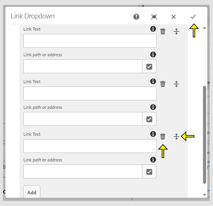
Reorder
to reorder, click the icon that looks like a line with up and down arrows. Then, drag and drop the link to your desired position in the list.
Delete
To delete, click the trashcan icon next to that entry.
After making your changes, click the check mark to save and close the window.