When working within the Content Parsys all web components must first be placed inside of a Section Component
The card component is used to group related content in a structured, styled container. It typically includes a title, text, and optional image or link, all within a clean, bordered box.
Click within a section component to insert new components.
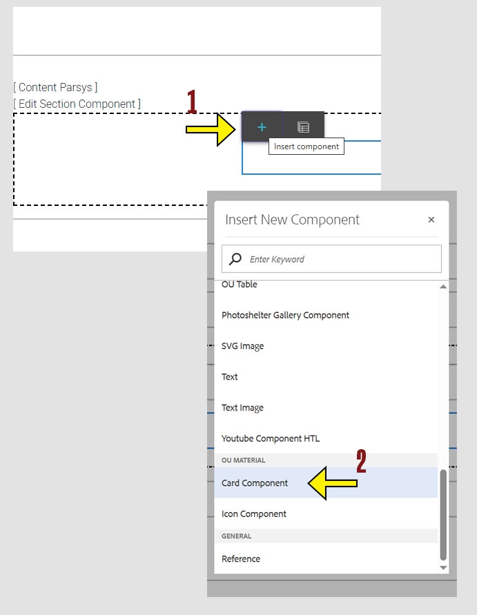
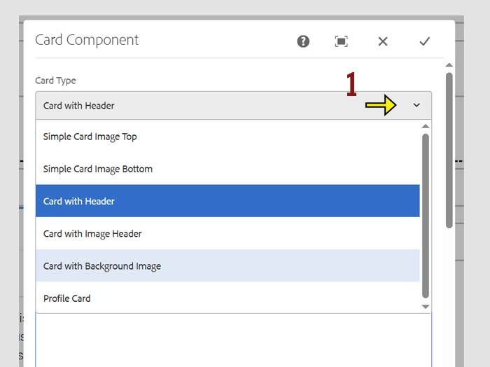
Cards are versatile components that organize content in a clean, card-style layout. They help visually separate information and make it easier for users to scan. Each style offers different configuration options.
There are several types of card styles available, including:
Once you’ve selected a card style, you can begin entering the content and settings specific to that style. Each style may have different fields, so the options you see will depend on your selection.
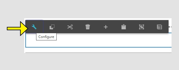
The properties of each style are demonstrated below.
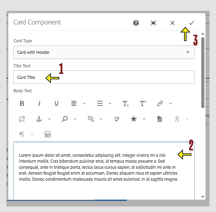
For this style, only two fields need your input:
These are the only required fields to complete this card style.
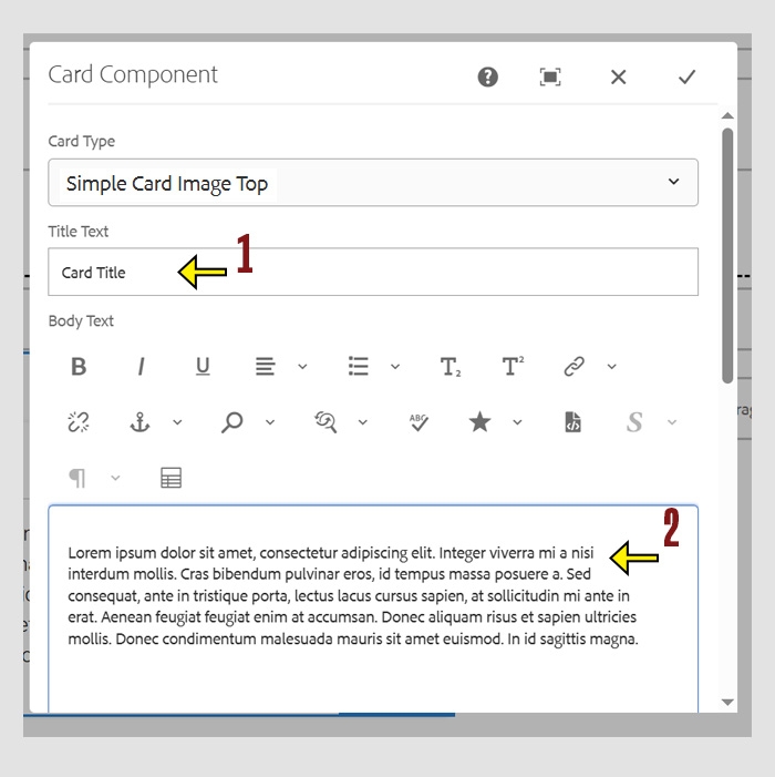
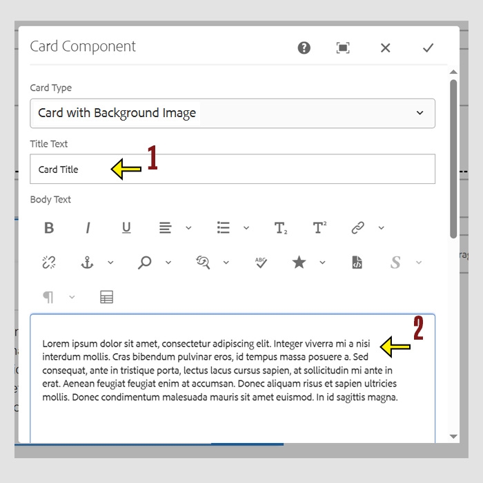
For this card style, complete the following fields:
Note: Do not upload images into the component directly from your computer. You must first upload images to the Digital Asset Manager (DAM) and then select them from there.
Tip: Recommended sizes for images used in this card style are 900 × 600px or 1200 × 900px.
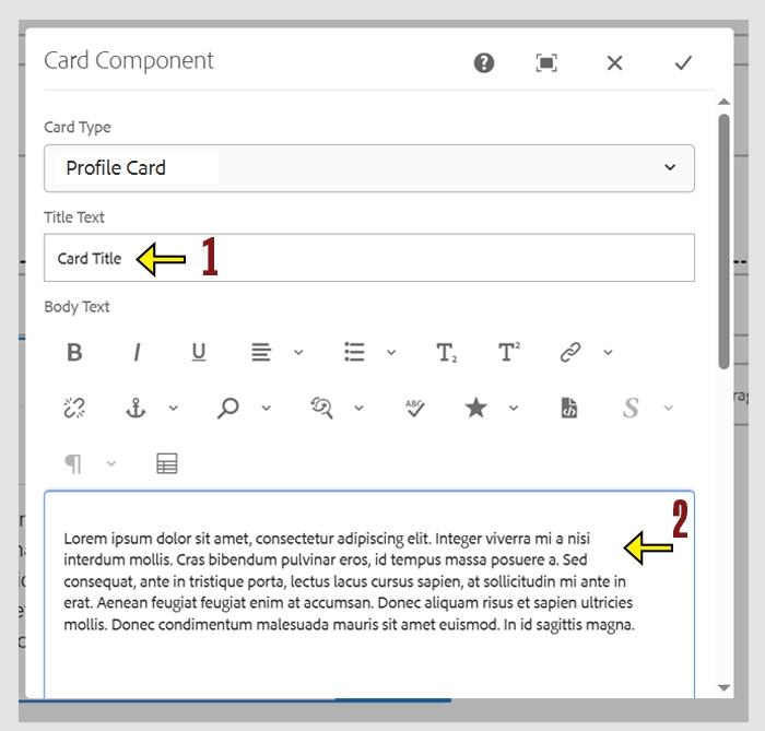
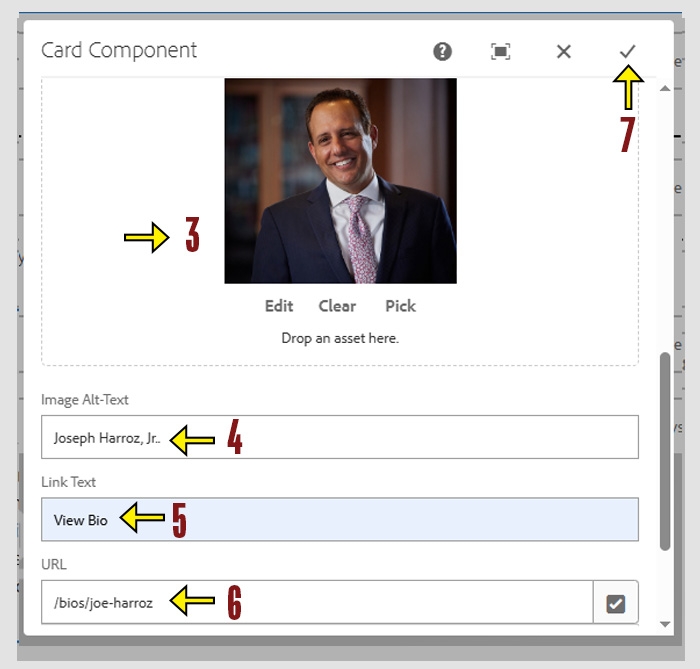
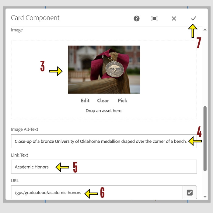
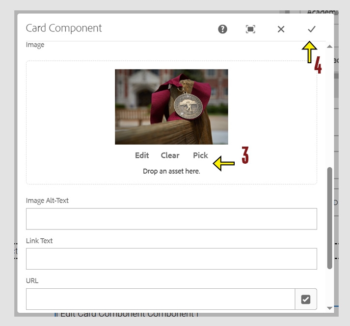

For this card style, complete the following fields:
Note: Do not upload images into the component directly from your computer. You must first upload images to the Digital Asset Manager (DAM) and then select them from there.
Tips:
For this card style, complete the following fields:
Note: Do not upload images into the component directly from your computer. You must first upload images to the Digital Asset Manager (DAM) and then select them from there.
Tips: