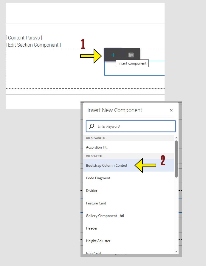
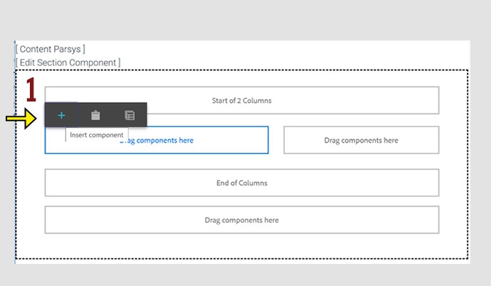
When working within the Content Parsys all web components must first be placed inside of a Section Component
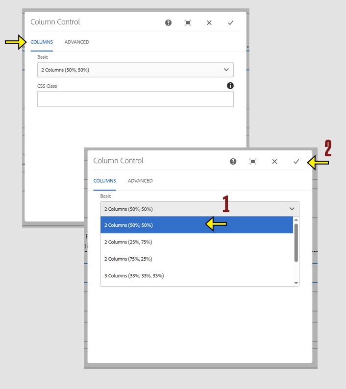
Bootstrap Column Control lets you arrange content side-by-side using a flexible grid layout. It helps structure your page by dividing it into columns that adapt to different screen sizes.
Jump to Topic
Click within a section component to insert new components.
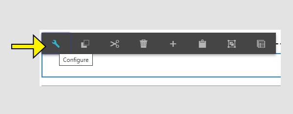
When the Configure options appear, you will see two sections:
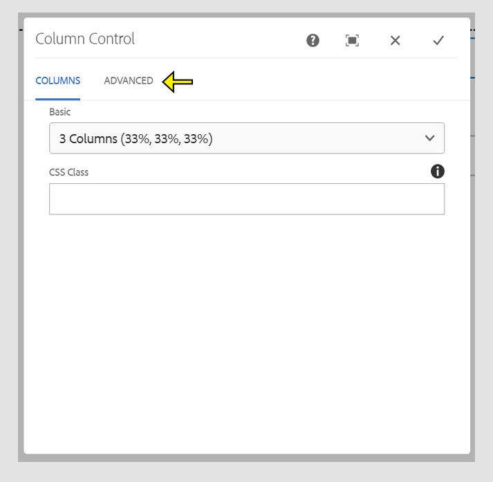
Note: Even if "2 columns (50%, 50%)" appears selected, you must actively select it again before clicking the check mark to save your changes.
Once you choose the layout that you want you can begin adding components into the columns.
Click within a column to insert new components.
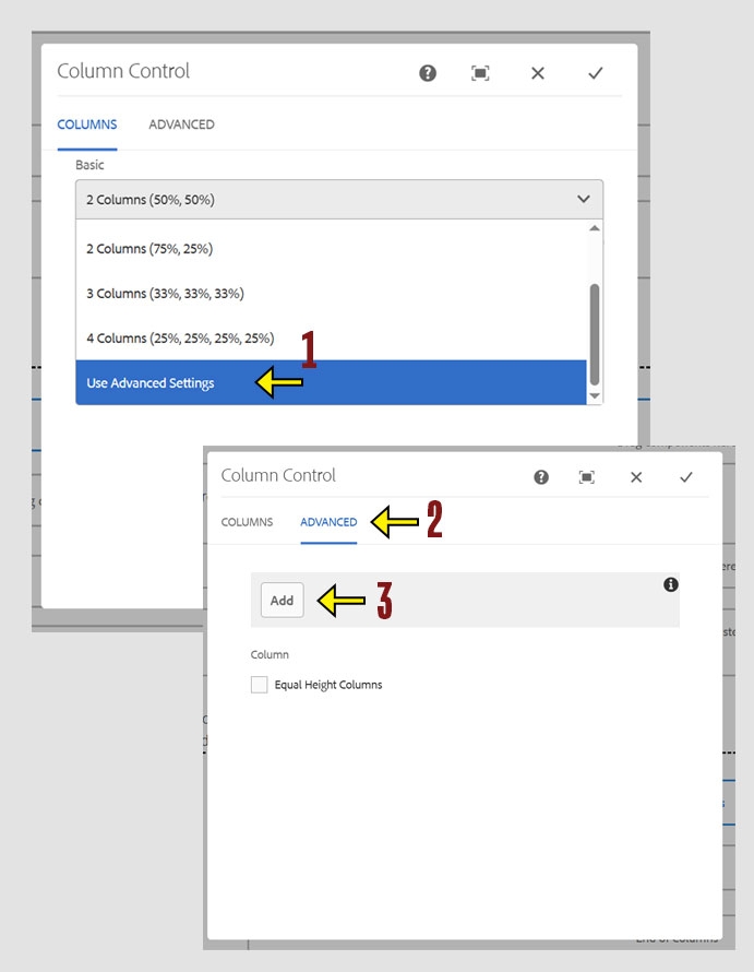
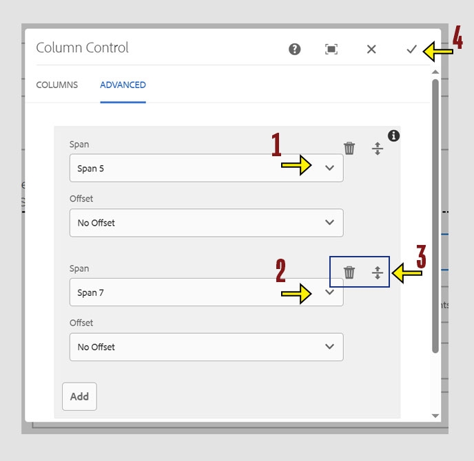
The Column Control allows a maximum total of 12 units. To format your layout, divide the 12 units across your desired number of columns. For example, a 5 and 7 split creates two columns at approximately 40% and 60%.
Once you hav configured the columns you want to use for the layout you can begin adding components into the columns.
Click within a column to insert new components.

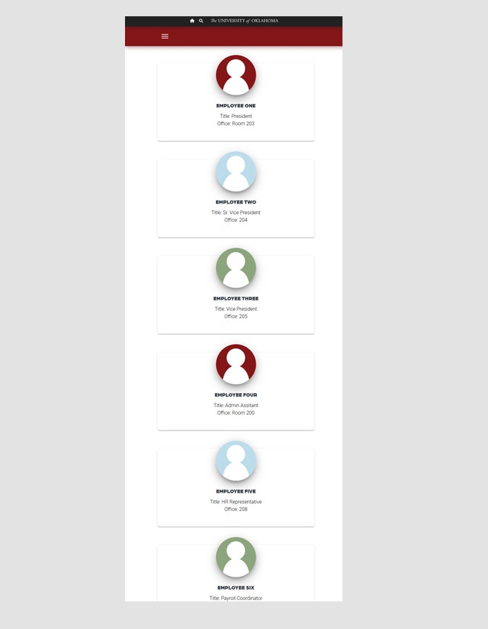
On mobile devices, all column layouts collapse into a single vertical stack. Columns appear in order from left to right, top to bottom. To maintain correct order and layout, you must start a new Column Control for each row. Skipping this step will cause columns to display out of order on mobile.
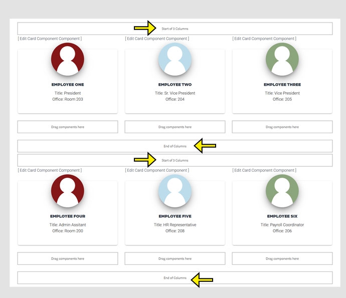
This example demonstrates how multiple rows of columns stack vertically when viewed on a mobile device.
To preview how your content appears on mobile devices, move your mouse to the right edge of your browser window until a double arrow appears. Then click and drag the edge to the left to resize the window.