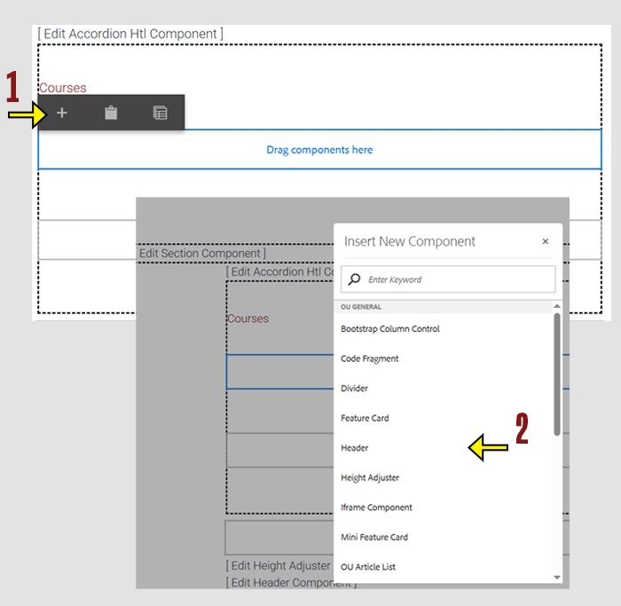
When working within the Content Parsys all web components must first be placed inside of a Section Component
Accordions are a very useful component, but they can be tricky. Read carefully to ensure that your accordion functions as it should, appears as you would like, and does not break anything on your page. Accordions require two parts:
Use Accordions to Organize Long Pages
Accordion components help make lengthy pages easier to navigate by collapsing content into expandable sections. They are especially helpful for:
They're a flexible tool to streamline your layout and improve the user experience.
Click within a section component to insert new components.
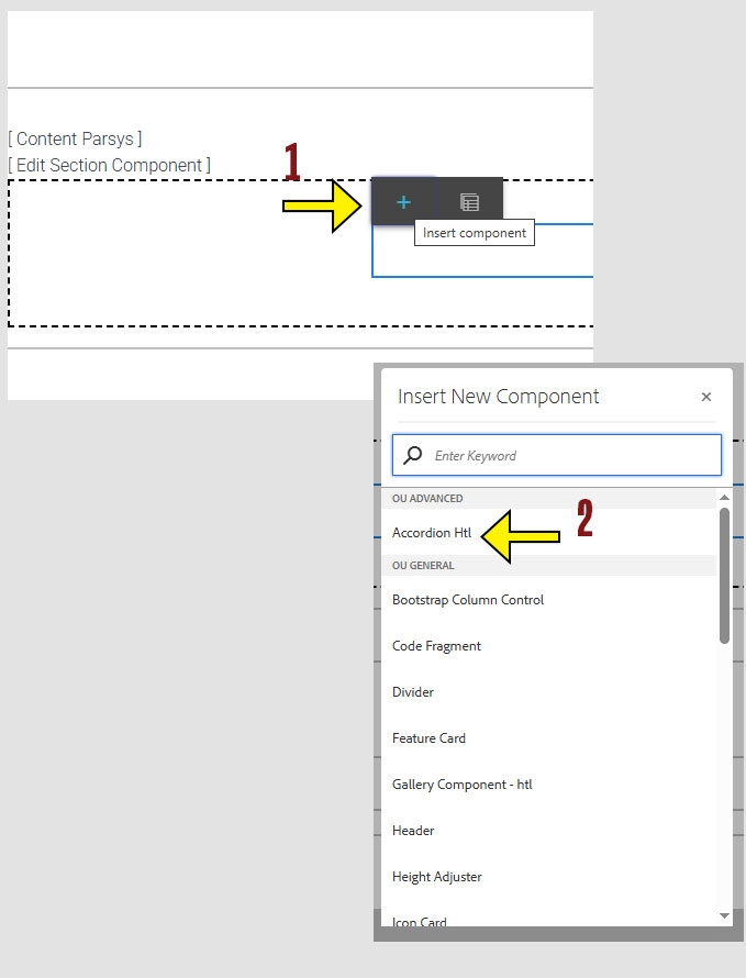
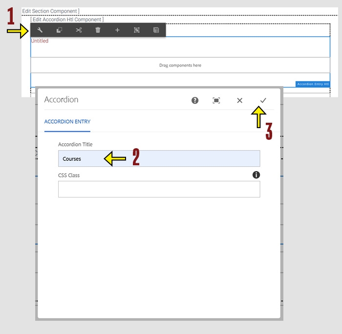
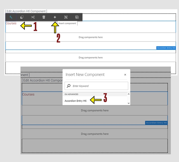
Click anywhere on the Accordion Entry to enable the toolbar. Click the wrench icon to open Configure mode.
In the Accordion Title field, enter the title you want to display.
Click the check mark to save your changes and close the window. To cancel without saving, click the X.
Tip: Accordion titles act as clickable headers. Use short, clear wording to help users understand what content they’re expanding.
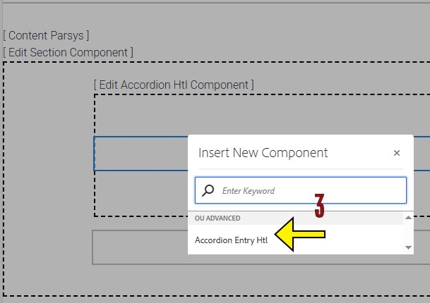
Now that you have your accordion entry added and named you can begin adding components into it.
Click within the accordoin entry component to insert new components.
Click the Accordion Title to reveal the toolbar.
Click the + icon to add a new component beneath the current entry.
If selected correctly, you should only see Accordion Entry as the available option.
If you see multiple component options, go back and make sure you clicked directly on the existing Accordion Entry, not the innor or outer container.
Tip: Each Accordion Entry acts as a separate section within the accordion. Repeat these steps to add as many entries as needed.
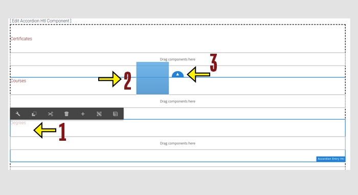
Click the Accordion Title to select the entry you want to move.
Click and drag the Accordion Entry to a new position. As you drag, your entry will be displayed as a blue box and blue arrows will appear to show valid drop locations.
Release your mouse to drop the entry in the desired location.
Tip: Make sure to drop the entry where the blue arrow appears to ensure correct placement.