Skip Navigation

Logos and Wordmarks

Logos and Wordmarks


Interlocking OU and Wordmark


Interlocking OU

The interlocking OU logo may be used alone in the case of licensed merchandise or in combination with the University of Oklahoma wordmark.

interlocking OU

Wordmarks

The wordmark should not be used without the interlocking OU logo except in special circumstances.


Linear Wordmark: interlocking OU, The University of Oklahoma, linear
Centered Wordmark: interlocking OU, The University of Oklahoma, centered

Health Sciences Wordmark

Interlocking OU, The University of Oklahoma Health Sciences linear wordmark.

The spacing between the logo and wordmark is equal to the width of the arm of the U in OU.

Interlocking OU, The University of Oklahoma wordmark. Illustrating the spacing with width markers.

Text height is half the height of the right arm of the U.
 

Interlocking OU, The University of Oklahoma wordmark. Illustrating the spacing with width markers.

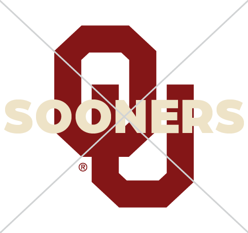
Interlocking OU with "Sooners" in a cream font color overlaying the OU, with an "X" over it demonstrating unauthorized text over the OU logo.

Never add unauthorized text to the OU logo.

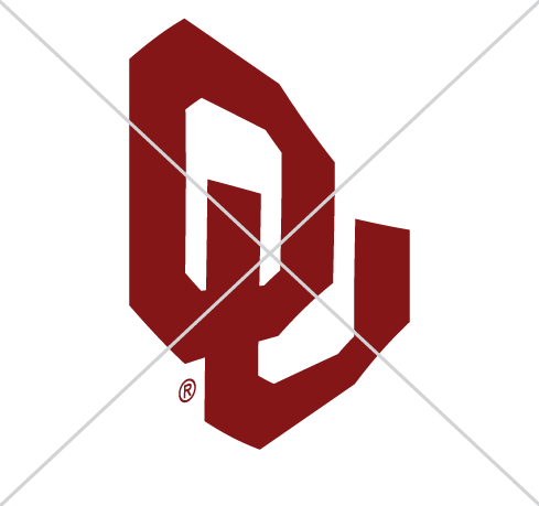
Never rotate the OU logo. The bottom of the "U" should always be a horizontal line.
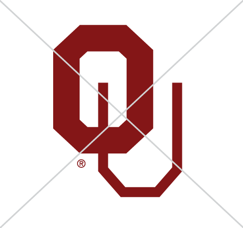
Never rotate the OU logo. The bottom of the "U" should always be a horizontal line.

Interlocking OU with an "X" drawn over it. The "u" is much thinner than the "o", demonstrating disproportioning of the OU logo.

Never reproportion any OU logo.

A skewed version of the interlocking OU with an "X" drawn over it. Never skew or distort any OU logo.

Never skew or distort any OU logo.
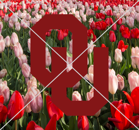
Interlocking OU with an "X" drawn across it, over a background image of red and pink tulips, which demonstrates the wordmark over an image without a holding shape. Never place any marks without a holding shape on an overly complex background.
Never place any marks without a holding shape on an overly complex background.

White interlocking OU surrounded by a crimson star, with an "X" drawn over it. Never put the OU logo in a unique shape.

Never put the OU logo in a unique shape.

An example of a vintage version of the interlocking OU wordmark, with an "X" drawn over it. Never use any unapproved vintage identity.

Never use any unapproved vintage identity.

Color Variations

The academic identity may only be reproduced in the official university colors. It is permissible to blind emboss or foil stamp the academic identity in silver, gold or metallic red. 

Crimson, Interlocking OU, The University of Oklahoma wordmark on a white background.
White, Interlocking OU, The University of Oklahoma wordmark with a crimson background.
Black, Interlocking OU, The University of Oklahoma wordmark in black font with a white background.

Sizes and Safe Zone


Minimum Height

To ensure clear reproduction and legibility, the marks may not be used smaller than:

Print: .35”
Web: 25 px
Interlocking OU with Minimum Height: Print – 0.35 in; Web – 25 px

Safe Zone

Determined by the width of the right arm of the U.

All logos and wordmarks for the University of Oklahoma also have an established safe zone. This zone maintains the logo’s integrity and avoids visual confusion. No other type or graphic element should fall within the minimum safe zones demonstrated to the right.


Safe Zone: Determined by the width of the right arm of the U. Interlocking OU, The University of Oklahoma wordmark. Illustrating the safe zone area.
Never resize or reproportion logo elements.

Never resize or reproportion logo elements.

Never change the orientation of any academic identity.

Never change the orientation of any academic identity.

Color Backgrounds

Always ensure there is ample contrast between the logo and the background color.

Do not apply effects to the logo (stroke, drop shadow, outer glow, etc.)

interlocking OU, crimson on white background
interlocking OU, crimson on light grey background
interlocking OU, crimson on grey background
interlocking OU, white on crimson background
interlocking OU, white on dark crimson background
interlocking OU, white on grey background
interlocking OU, white on dark grey background
interlocking OU, white on black background
interlocking OU, black on white background
interlocking OU, black on light grey background
interlocking OU, black on grey background

Athletics

PLEASE NOTE: The Athletics interlocking OU with a white outline may be used on gray and black backgrounds.

interlocking OU, crimson outlined in white on dark grey background
interlocking OU, crimson outlined in white on black background

Photo Backgrounds

When using the logo on photo backgrounds, keep the following in mind.

Do not:

  • Obscure the focal point of a photograph
  • Place logos on distracting, cluttered backgrounds
  • Darken or lighten the photograph noticeably or unnaturally (a crimson overlay treatment may be used to create the contrast needed)
  • Apply effects to the logo (stroke, drop shadow, outer glow, etc.)
Light Backgrounds

Only use the crimson logo on light photo backgrounds that provide clear contrast (for example, snowy fields, blue skies or light walls).

Crimson OU on snowy picture background

Dark Backgrounds

The white logo may be paired with darker photos.

White OU on dark, leafy picture background

University Seal

The University Seal is primarily used for official university purposes, such as publications of the institution, certificates, diplomas, legal documents and printed materials in conjunction with official functions of the university.

The Seal may be used for commercial purposes with appropriate authorization from OU Licensing.

crimson University of Oklahoma seal
black University of Oklahoma seal

Norman Campus Academic and Department Marks

Colleges and Departments are the lifeblood of the university. Visual identity reflects the strong OU brand while featuring the name of the unit in an easily recognized manner.

Branding may have up to four lines of text. In all cases, the identity utilizes the font Adobe Garamond Pro.

College and department logos are available upon request. Make your request through your Marketing and Communications Account Executive.

In some cases, adjustments may be made with approval from Marketing and Communications.

For some academic promotional items, adjustments may need to be made to the wordmark. Please contact marcomm@ou.edu for more information.

Linear Version


Two-Line

Interlocking OU, College of Law, The University of Oklahoma wordmark, two-line example

Three-Line

OU College of Atmospheric and Geographic Sciences, School of Aviation, The University of Oklahoma wordmark, three-line example

Four-Line

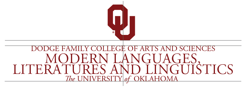
OU College of Arts and Sciences, Department of Modern Languages, Literatures and Linguistics, The University of Oklahoma wordmark, four-line example

Centered Version


Two-Line

Interlocking OU, College of Law, The University of Oklahoma wordmark, two-line example

Three-Line

OU College of Atmospheric and Geographic Sciences, School of Aviation, The University of Oklahoma wordmark, three-line example

Four-Line

OU College of Arts and Sciences, Department of Modern Languages, Literatures and Linguistics, The University of Oklahoma wordmark, four-line example

Health Sciences Academic and Department Marks

As an academic health care center, the University of Oklahoma Health Sciences embodies the tripartite mission of education, research and patient care. With its seven health professional colleges, the OU Health Sciences educates the providers and researchers of the future.

Branding may have up to four lines of text. In all cases, the identity utilizes the font Adobe Garamond Pro.

College and department logos are available upon request. Make your request through your Marketing and Communications Account Executive.

In some cases, adjustments may be made with approval from Marketing and Communications. 

For some academic promotional items, adjustments may need to be made to the wordmark. Please contact marcomm@ou.edu for more information.


Linear Version


Two-Line

Interlocking OU, College of Allied Health, The University of Oklahoma Health Sciences wordmark, two-line example.

Three-Line

Interlocking OU, College of Medicine, Department of Medicine, The University of Oklahoma Health Sciences wordmark, three-line example.

Four-Line

Interlocking OU, Hudson College of Public Health, Oklahoma Public Health Training Center, The University of Oklahoma Health Sciences wordmark, four-line example.

Centered Version


Two-Line

Interlocking OU, College of Dentistry, The University of Oklahoma Health Sciences wordmark, two-line example.

Three-Line

Interlocking OU, Fran and Earl Ziegler College of Nursing, The University of Oklahoma Health Sciences wordmark, three-line example.

Four-Line

Interlocking OU, College of Allied Health, Department of Communication Sciences and Disorders, The University of Oklahoma Health Sciences wordmark, four-line example.


Never add your own text to or over the logo.

Never add your own text to or over the logo.

Never rotate the logo. The bottom of the ”U” should always be a horizontal line.

Never rotate the logo. The bottom of the ”U” should always be a horizontal line.

Never reproportion any logo.

Never reproportion any logo.

Never skew or distort any logo.

Never skew or distort any logo.

Never create your own color breaks for OU logos.

Never change the color of the logo.

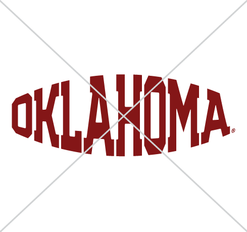
Never alter the fonts of the logo or wordmark.

Never alter the fonts of the logo or wordmark.

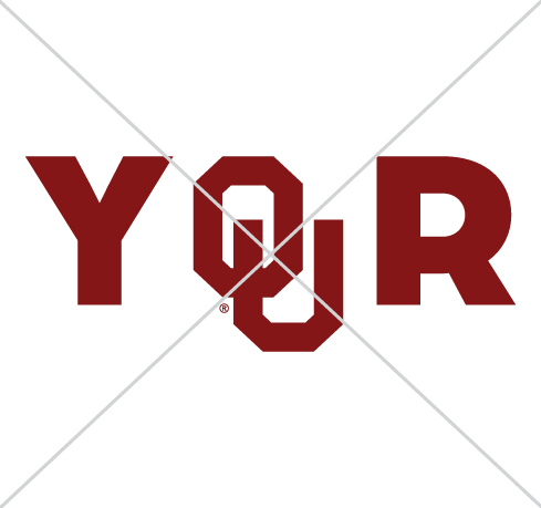
Never use the interlocking OU as letters within a word.

Never use the interlocking OU as letters within a word.

Never put the logo in a unique shape (star, trapezoid, etc.).

Never put the logo in a unique shape (star, trapezoid, etc.).

Never use an unapproved vintage identity without Trademark and Licensing approval.

Never use an unapproved vintage identity without Trademark and Licensing approval.

Never apply effects to the logo (stroke, drop shadow, outer glow, etc.)
Never apply effects to the logo (stroke, drop shadow, outer glow, etc.)
Never create your own color breaks for OU logos.

Never create your own color breaks for OU logos. 

Never put the helmet art on a dark background without its white holding shape.

Never put the helmet art on a dark background without its white holding shape.

Never use unapproved names with the OU athletics logos.

Never use unapproved names with the OU athletics logos.

Never use the interlocking OU logo as part of a word.

Never use the interlocking OU logo as part of a word.

Never emphasize the letters "OU" in text.

Never emphasize the letters "OU" in text.

Never distort any OU logo.

Never distort any OU logo.

Never use unapproved wording in any OU logo.

Never use unapproved wording in any OU logo. 

Never alter the fonts of the logo or wordmark.

Never alter the fonts of the logo or wordmark.

Sooner Schooner

The Sooner Schooner is primarily used to represent OU athletics, and should adhere to all Licensing and Trademark guidelines. For approval and guidance on use of the OU Schooner mark, please contact OU Marketing and Communications.
crimson Sooner Schooner
black Sooner Schooner