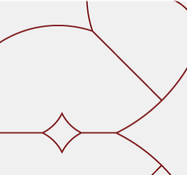
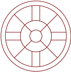
Linework can be used within compositions to connect disparate elements on a page, frame up important words or images for emphasis, or add a layer of texture to create depth.
Ornamental shapes inspired by campus architecture may be used as small accents or large, graphic patterns.
Linework should utilize a single stroke weight and minimal detail to create an abstract, geometric look.
Solid rectangles may be used to add weight to sections of the line work, using a 60° notch to add a dynamic quality. These are inspired by the motifs of the Ruf Neks paddles.


1. A double rectangle serves as a visual divider between the logo and the copy in this ad.
2. Cropped architectural illustrations create an abstract texture.

3. Gridded lines create a structure over top of a photo, providing a framework with consistent padding to align copy, an additional photo, and the architectural illustrations.
4. Adding a solid rectangle in an accent color draws the eye around the composition and creates visual interest and balance.

5. Here, forward arrows create rhythm and movement and relate conceptually to the copy within the piece.