Our campaign line, “There’s Only One”, is always set in a combination of Mongoose Bold and Arboria Black.
Three versions may be used, as demonstrated here.
Mongoose Bold is our primary headline font.
Arboria Black is reserved for 1-2 words per headline, to create emphasis—in this case, on the word “One.”

Use a consistent cap-height for words set in Mongoose Bold and Arboria Black (this will need to be adjusted manually).
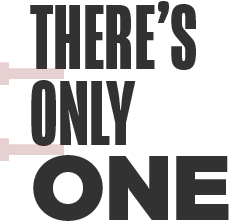
The leading should be tight with just enough breathing room.
Use the width of the stem of the Mongoose letter T as an approximate guide when setting headlines.

When stacking the campaign line, increase the width of “One” so that it is fully justified with “There’s Only”.
In addition to standing on its own, the campaign line may be used as both a headline structure and payoff.
Two type treatments are available for use in these instances.
Reminder: Headlines should always utilize all-caps Mongoose Bold and Arboria Black.
The campaign line is integrated into the headline, continuing the sentence in the same type size.
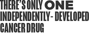
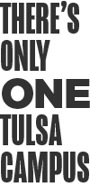

The campaign line may be treated in a different size than the rest of the headline, as either a lead in or sign off.
To create sufficient contrast, the smaller campaign line is set to approximately one half of the cap-height of the rest of the headline.


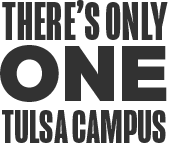

To create visual interest and emphasis, general headlines may utilize a mix of typefaces (using Arboria to highlight 1-2 select words) or a shift in scale.
Keep legibility in mind as you create headlines: larger bodies of text may become hard to read when set in all Mongoose. Break it up by using Arboria. Make sure the type size is large enough to be legible and accessible on every medium.
Reminder: Headlines should always utilize all-caps Mongoose Bold and Arboria Black.
In campaign-agnostic headlines, words besides “One” may utiilize Arboria. Seperate the two typefaces with a line break.*

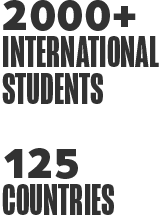





Never use Arboria alone in a headline.

The larger, emphasized line should always be set in Mongoose Bold.